Apple Watch Series 3 Review
A review from a newcomer's perspective.
Preamble
Apple Watch Series 3 is my first smartwatch and first Apple Watch. As I have no previous Apple Watch to use as a comparison, this review will speak to my experience with the current generation of the product.

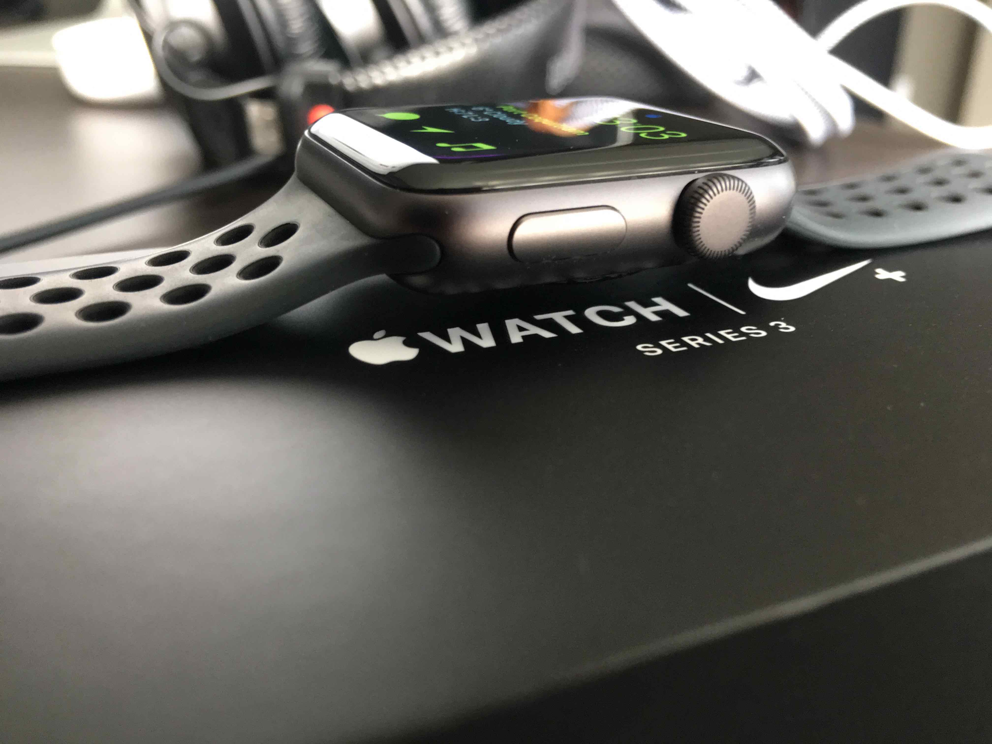
Last week I went into an Apple Store and purchased a Space Grey Series 3 (Nike edition). I opted for the non-LTE version for two reasons: it's more expensive and my carrier has an LTE band that isn't compatible with my iPhone 6S Plus.
I've been lusting after an Apple Watch ever since its debut with Series 1, however, I knew it would be worth being patient to see how this new product category would mature over a few generations. Series 1 felt like too much of a risk. No native apps, sub optimal performance, no GPS, and too much reliance on iPhone.
First Run Experience
Setting up Apple Watch for the first time went relatively smoothly. After installing the watch app on iPhone and pairing it, which happened instantaneously, I was ready to start using it. All watchOS apps synced quickly and I could begin choosing a watch face to customize (more on that later).
The hardware came preloaded with watchOS 4.0. I was not initially aware that 4.1 was available until I remembered to check for updates after I had been wearing it for a few hours. I opted to install 4.1 before diving too deep to ensure I was getting the best experience. I wouldn't say I hit a snag necessarily, but installing watchOS updates was painfully slow. The setup app gave me an ETA of 33 minutes to install the update, which ended up being pretty accurate. I consulted with my podcast co-host Michael Norton, and he said the update has to be installed over Bluetooth, which explains the long wait time.
Watch Setup App
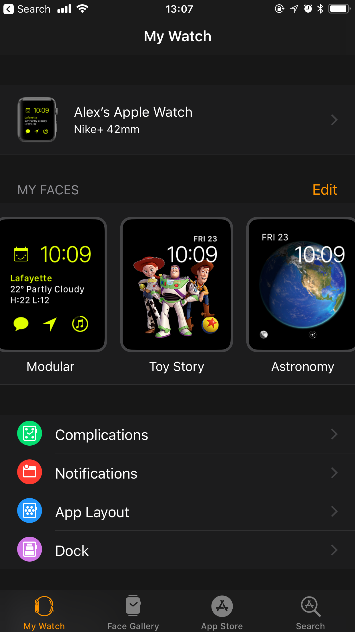
The watchOS iPhone app provides a lot of configuration flexibility for your Apple Watch. You can change watch faces, customize them by adding or removing complications, change colours, choose what apps to sync, and more. My biggest gripe with the setup app is I don't like how it seems tacked on and not part of iOS. The app had to be downloaded, which I believe should be integrated directly into iOS settings.
The UI of the app seems odd as well. It doesn't jive with the iOS 11 design aesthetic with its dark black and orange motif. There's a special shortcut in the app to a watchOS category of the App Store. You can search for and install watchOS apps. Why not just make this part of the regular App Store app? Everyone knows you need to go to the App Store to install apps. I don't think it's a stretch that a dedicated watchOS tab or category could be included there. I suspect we'll see further integration and refinement in future versions of iOS as Apple Watch continues to gain traction in the marketplace.

watchOS Apps
watchOS apps come bundled with their iOS counterparts (if the developer makes that available). I like that I don't have to worry about hunting for a companion app for my favourite iOS app, they're just there.
I've had some time to play around with most of the apps installed on my Apple Watch. The experience is a bit all over the map. Some apps seem like they were carefully made and perform well whilst others didn't work reliably and were slow. For example, Instagram offers two main pieces of functionality: Feed and Activity. Unfortunately, I could never get the photo feed working, I just get a message saying the connection was lost. Near as I can tell, it should just work without any fiddling on the iOS app. Facebook Messenger has also been unreliable. Sometimes the history of messages stay in sync, but other times new messages fail to load (even on WiFi). Another issue I had were thumbnails of the messages not appearing. It looks as if there should be something there, but instead there are missing images.
Some of my favourite iOS apps either have no watchOS app, or have an app but no complication. Having no complication is frustrating as that provides single tap access on a watch face. I simply raise my wrist and tap to invoke functionality. Apps like Transit that I reply on for real-time data would prove very useful if they had a complication (apparently it's being worked on).
Perhaps many of you listen to podcasts. I do too. My podcast app of choice is Supertop's Castro. Regrettably, they don't have a watchOS app, however, because of the "Now Playing" screen, you can at least play/pause, adjust volume, and skip. I really was hoping they would have a watchOS app so I could begin playing a podcast without reaching for my iPhone. That brings me to one of the reasons I purchased the Apple Watch in the first place: I want to reach for my iPhone as little as possible. I tried a few other podcast apps like Pocket Casts and Overcast, which did have watchOS apps, but both lacked a complication. I'll keep monitoring the podcast app market and see how things play out. As an side, you can't control volume from third party apps yet. Apple has not made that available to developers via an API (I find that most perplexing).
Fitness
I'm not a marathon runner, however, fitness and nutrition are important to me. I've used Apple Watch for less than a week and I'm already feeling more empowered about my health. Every day I'm encouraged to meet and beat daily activity goals, such as burn calories, stand and stretch, and focus on my breathing. As this review is not focused on the fitness aspects of the product, I will say that it does make a difference. I've barely scratched the surface and haven't even tested its waterproof capabilities and pool lap-time functionality.
watchOS Design and Direction
Although we're three years into Apple Watch's lifespan with incredibly powerful hardware and functionality, the software leaves much to be desired and feels like it's in its infancy. This is not to say that it's a terrible experience or is clunky, but there's a ton of room for refinement. Frankly, I'm more excited about watchOS and its direction than I am about iPhone.
With the recently released 4.1 update, not only were bugs addressed, a ton of useful features were added to make Apple Watch a more pleasant experience. One of the biggest is streaming music from Apple Music without using your iPhone. Siri is smarter and can be used to find, discover and play songs, playlists or albums, and fitness data syncs with GymKit-enabled treadmills, ellipticals, stair steppers and indoor bikes for more accurate distance, pace, and energy burn metrics.
After spending only four days with the device, I'm a little embarrassed to say using it wasn't as intuitive as I expected it to be. I consider level of technological experience as very advanced. I've used, tinkered, and have written about technology for a long time. I know iOS, iPhone, and iPad very well. The first 24 hours were slightly frustrating. For example, I didn't realize that I could control playback volume of music from the Digital crown by turning it. The Digital Crown itself has been a tad confusing as well, but I think I have a handle on it now.
Conclusion
In 2015, watchOS 2.0 was released with support for native apps, which unleashed the hardware's potential. Native apps made an enormous improvement in what was previously sluggish app performance. You can find plenty of comments from Apple Watch users if you search, but many have said it made their Series 1 feel new again.
Consider how far Apple Watch has come from just one major software update. Three years later and now we have both hardware and software that has untethered the watch from iPhone. The LTE version is a totally different beast that's out of scope for this piece, but at some point, I'll upgrade when the time is right. For now, watchOS feels like it's at the start of something truly unique and exciting, and I'm looking forward to seeing where it goes with next year's 5.0 update.
[bctt tweet="watchOS feels like it's at the start of something truly exciting. Just wait until 5.0."]
I'm curious what your experience has been like with Apple Watch. You may write to me via email and let me know.

