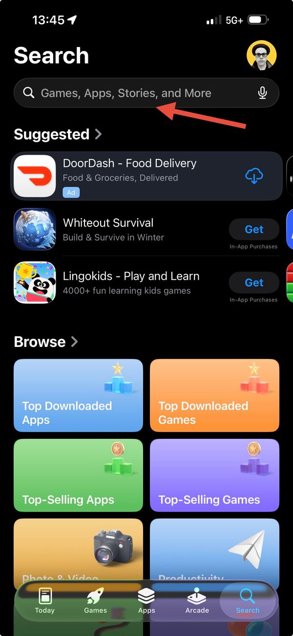
Enough with The Blue Icons
If you haven't noticed yet, perhaps this isn't a problem for you. The App Store in its current state contains a glut of apps with blue icons. Why do people keep choosing this colour for their app icon? All things considered, blue is probably one of the least offensive colours. Of course, there are many shades of blue -- some more pleasing than others.
Apple is particularly bad at including too many built-in apps that not only have blue icons, but near as I can tell, have the same shade of blue. For example: Safari and Mail. These two apps live on my home screen because I need quick access to them all day. If it weren't for that, I'd stuff them into my "Blue Shit" folder -- where blue icons go to die. I'm so tired of blue that I'm seriously considering deleting that entire folder, even though I do use these apps often. Yes, I know, nerd problems.

Why do we have an absence of other colours in our icons? I also have a growing collection of red icons with white typography. The trend seems be ubiquitous use of two tones. Whilst this keeps things simple, I posit that adding a hint of other colours to your app icon wouldn't do it any harm. In fact, I will go as far to say that it will make it stand out more amongst the plethora of overly simplified and common looking apps that are out there.

On my home screen here, an example of an icon that is well designed is Fantastical. Without any words, the image is able to easily convey to the user that this is a calendar app. It doesn't just use one or two colours, but it makes good use of red, white, grey, green, purple, with a hint of yellowish orange under the page flip. A second good example that I really like is Dialvetica. The icon is broken down into four quadrants and contains recognizable glyphs that you'd find on a phone dialer, thus it tells me it has something to do with making calls. I love how they use three different colours here.
I really hope that we'll see an increase in diversity of app icon colours and designs. I don't think it's good enough to simply make a gradient, slap a single letter on your icon, and call it a day. I find this approach too simplistic and it strikes me as an easy way out. You should give your app icon some serious thought and love — after all, it's what people have to stare at every day.


